Just stumbled across this rather interesting vector based illustrator. From his web-site: "Ben Yin-Pan Kwok (BYK) aka BioWorkZ is a traditionally trained illustrator with a BFA Degree in Illustration from California State University Long Beach. Ben was born in Taipei, Taiwan and moved to California at the age of 4 and has lived in Los Angeles ever since. Working as a graphic artist in the fashion industry for several years has allowed Ben to develop his comfort with vector programs."
Though this work interesting, what really caught my attention was the stuff on the merchandise link that leads to YouWorkForThem.com . Which is full of all sorts of inspiring and interesting stuff. I especially liked the videos which are all available as little pop-out previews (see pic).
I got to see Adrian Shaughnessy and Tony Brook's lecture at the printworks yesterday, a D&AD sponsored event that was partly engineered by staff at Stockport College. The lecture focussed on the launch of the pair's new publishing company, Unit Editions. Founded in 2009 they have set out to produce high-quality books about graphic design and visual arts in the way they want to, without the pressure of someone else telling them what to put in them.
I was lucky enough to attend a Q&A session with Adrian before the lecture and he gave us advice on how to meet clients and get started in the industry. As someone who has experience of setting up his own studios and business and a former editor of Varoom magazine he was an ideal contact and had lots of relevant advice for us all.
He told us to make the effort when presenting portfolios to not just show them to ourselves, he is amazed by the amount of people who just sit there and admire their own work when presenting to him, not bothering to turn it to face the client and just burying their heads in their own work. He gave us advice on the layout and format for the folders and about putting things in context so clients can see pieces in-situ.
Next up he explained how much of a difference it makes when things feel personal to a client, the way he prefers things to be put to him Little things like a complement on past work and why you are interested in working with someone can make a client warm to your proposal and help set you apart, not just looking like you have sent out the same letter to ten different prospective employers. Things like hand-writing addresses and making the appearance of the whole package look like it was considered and works with the samples you send can also help.
We talked about always leaving something with the client and what/how much is appropriate. Letting the client have something to remember you by and staying fresh in their minds by keeping them updated on your progress, recent work and accomplishments can all help to get you more, perhaps better work down the line.
He also gave us some advice on internships saying that he has always paid his interns something, and whilst of course it's a personal choice, you should consider very carefully whether or not you are prepared to sacrifice and work for nothing. One thing he did say about this kind of work is that if you're going to do it then you must make yourself and invaluable member of the workforce. So that when you leave they will be scratching their heads thinking to themselves; 'Oh no, what are we going to do without ..name here..'.
About a three to four month window was recommended for posting new things to clients to keep them interested, once you have met someone they become a contact and must be kept informed and refreshed.
And last but not least, always be looking for the next job!
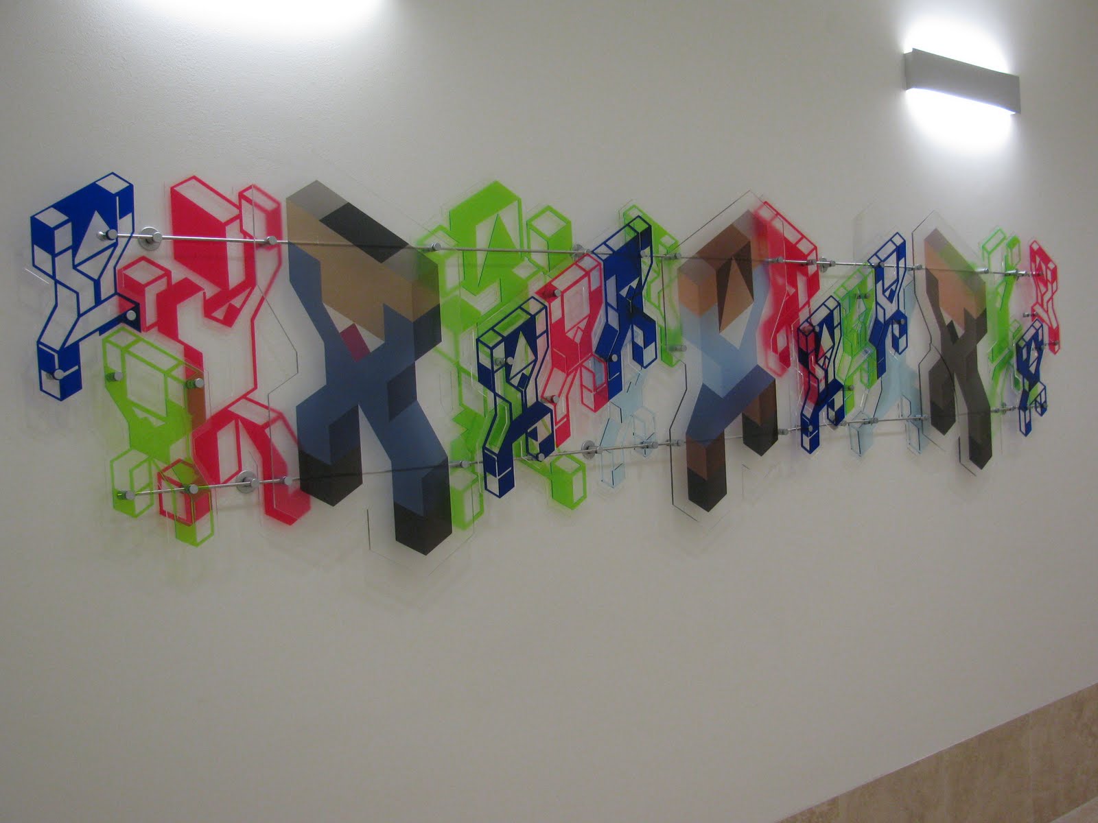
Here's a picture of the work I recently completed for KPMG's new building in Canary Wharf.
The piece was a challenge from start to finish.
I first started work on the project in 2009 for the D&AD student awards and received in-book status. This led to a follow up pitch before the KPMG art committee at which I managed to secure a commission. This meant pushing the design even further and then getting the perspex cut and the fittings ordered.
As you can see the piece works nicely in it's location near the presentation suite in the new building that has recently opened.
Mocking up samples for my project meant recently getting my first experience of laser cutting.The laser cutter at Fred Aldous’ was recommended to me and using it was an exciting and revealing experience.
There was a little advice to get acquainted with the technical side of things, preparing files and some basic laser settings. I learned about things like setting the speed and focus of the laser to achieve different depths of cut for different materials then, before to long I began to see my designs coming to life. It was so satisfying seeing something that had previously only existed on a computer program becoming an actual physical object.
As I left the machine to do its thing I had time to look around the studio and chat with Paul as he explained some of the other projects that had been created using the machine.
This was extremely interesting and gave me lots of new ideas. There was a small wooden block with the Manchester City F.C emblem engraved in it and I heard about how new players to the club are presented with a box engraved this way containing the club’s code of conduct.
Other samples included wedding and christening invitations made from card, pieces of jewellery made from Perspex, signs for desks or shops and an engraved ipod.
Some pieces are engraved at different depths with the scorched wood effectlooking particularly nice.
The whole experience has filled me with new ideas and possibilities for using this technique and above all gave me lots of information to help complete this project.
Another gallery I visited while I was in London last week was Kemistry.. Hiden (sort of) down a little side street this little gallery had on a display of polish poster design, entitled 'Homework', the name being that of the design group exhibiting. They hail from Warsaw.
Joanna Górska and Jerzy Skakun enjoy using visual puns in a very concise fashion. Being credited with bringing polish poster design back to life they have imbued it with a new sense of modernity and style.
With a client list to die for and a fresh vibrant style Anthony Burrill's work has been catching my eye quite a lot recently. A Lancastrian graduate of Leeds poly then a Graphics MA at the Royal College, he works with a range of media including illustration, 3d and video. I was particularly interested in his 2009 exhibit at Kemistry gallery London entitled 'In a New Place'. This consisted of perspex pieces that have a shiny fresh modern look and feel (see the pics). I also noticed his recent video pieces and they are in line with the 60's psychedelic atmosphere of much of his work, with flat vector shapes and bold colours.
The work of (mr) Ian Wright consists largely of contemporary portraiture, but also some clever graphic ideas. His work has been featured in gallery spaces and also in magazines making him someone interesting to look at.
This video shows him talking to It's Nice That about his work, including an interesting section on installing large artworks on interior walls.
Using everyday objects or those that relate specifically to his subject his work has a character that is intrinsic to it's style.
Although I missed her lecture at our college, I was pointed to the work of Lauren Moriarty and her work at the festival hall in particular. An interesting application of coloured vinyl to these windows offers more exciting, cast shapes for the interior space.
My tutor put me on to this guys work a while ago and since I have been looking into film and merging different disciplines together he popped back into my mind, I looked at his site again today.
I have been paying special attention to the 'History of gaming' and 'Future of Gaming' videos, and they have been filling my head with fresh ideas and giving me perspective on my own. Containing all sorts of conspiracy theory ideas involving Sony's playstation 2 console ; 'Future of Gaming' cleverly encapsulates a feel of modern society's entertainment obsessed nature.
Its nice that you can see some pages from his sketchbooks on the site (evidenced above) although it would be nice if they were at a resolution good enough to be able to read his notes. You can see from the pages that there is a very strong relationship from his sketch work to the final product.
His site shows that he combines all sorts of media from 3d visuals and vector work to carefully modelled prototype like constructions and everything in-between.
I am attempting to complete a work for the Onedotzero brief for entry into this year's D&AD competition and so have been looking at some of the film makers they have been involved with .
I have some screenshots and links for some of their work here.
Gaelle Denis has an interesting style whereby composite elements are merged with real time footage. Creating an eerie, fairy tale type feeling.
The examples of film projects listed on Quayola's site are interesting and quizzical. Combing 3d elements (i think) with stills to create work with an ethereal feel to them.
I'm not sure if this is from them (please correct me, if you know) but I really like the look of it and the suggestive nature it has for someone like me...
Their work is certainly plentiful. The site is just inviting you to spend at least a couple of hours wallowing in its visual pool, with various music videos, titles, idents and general filmage.
Check out what Charlie Parker thinks is cool enough to blog because I think he is right!
Speaking of which I just found this on said blog and had to let you see it! (words/image taken from Lines and Colours, I would've posted something directly from Eric Feng's site but it was taking ages to respond due to everyone and his dog being online at the moment, that and some pretty heavy video use on the site. I'm sure it's lovely but Sorry Eric I couldn't watch it)
Upon my travels searching for things I might like to do for a major project I happened upon this list by Dani Jones of (funnily enough) things for an illustrator to do. It includes suggestions such as "create-a-monster-a-day-for-a-month", and smaller activities like "why did the chicken cross the road?". All of the activities are split into sections such as 'practical projects' or 'academic exercises'.
Dani ( a children's illustrator) also has lots of other content on her site including practical tutorials and even on weekdays a live, streaming show on which she will create illustrations and the like...
Here is a site I just visited featuring some of the very best illustrative content by people really pushing their art...
Drawn! is "a collaborative weblog for illustrators, artists, cartoonists, and anyone who likes to draw. Visit us daily for a dose of links and creative inspiration."
I was lucky enough to attend Charles Hively’s lecture; ‘The Rise and fall and rise of American Illustration,’ at Sheffield University this week.
Hively is the producer of 3X3 a three times a year publication devoted solely to illustration. The format being that it features three illustrators written about by three of their illustrator friends. The aim of the magazine is probably best put on the magazine website;
“Our mission is to spotlight the best international artists working today and encourage a new focus on the use of illustration by the advertising and design communities.”
Being an ex-illustrator himself Hively started the magazine amongst a lot of negative advice from people telling him the magazine would never be successful, despite this, the magazine has gone from strength to strength since its first edition now reaching issue13.
It must be said that Hively is really all about promoting illustration as a valid method for communication compared to say, photography.
In his lecture he first explained how he got started in illustration, producing an illustration whilst under the influence of a bad cold, as well as the drugs which he had taken to subdue its effects. Producing a, ‘squewy, lined drawing’, of a local scene with a Christmas message, he was convinced that it would never see print. He was wrong of course and this was the launching board for more freelance work.
Launching an advertising agency and then becoming a creative director, he also became more involved in creating the layouts for the magazine he was involved with. This led to critical acclaim.
This gave him the opportunity to hire people that he really admired the work of and enjoy the relationship of working with people coming up with ideas. He really likes concepts and not just decoration.
This career led him to do photography, illustration and art direction, he also worked as an advertising head and this left him with a unique perspective when looking for the next thing and deciding to do 3x3 as a publisher.
Hively, as I have said is a strong believer in illustration going so far as to say that we; ‘have the power to change the cultural environment.’ Pointing out historical examples from American illustration of people wanting their hair lin the style perhaps of how a certain illustrator had drawn it or how everybody at one time could recognise, and know the name of, whoever had done a particular illustration, such was their notoriety.
The next section of the lecture contained what Hively saw as reasons for the ‘death’ of illustration. He named photography as art as one siting people like Steiglitz as art-photographers, suddenly making illustration look very dated. Photography was now capturing the environment in the way that illustration once had.
Another reason was art schools, coming up with abstract ideas representing things like emotions, that were before recognisable as an expression or action that the illustrator would draw now becoming strange shapes and smears of colour for example.
One that you might find surprising was the Apple Mac, whereby he talked aboutus no longer needing scrap files for resource and just googling everything for example.
Of course the lecture was not a bleak eulogy for illustration and Me Hively was of course dutifully bound to tell us of the resurrection of the illustration world and why his magazine is so successful.
He took us back to a day before computers and even photography (at least before it was used widely in print) and showed how art and illustration were almost the same thing. Moving on, he showed us how things moved on and illustration started to be used in advertising, with the obvious advantage that an illustrator can show an idea and not just a piece of art.
One problem he noted was that when he mentioned (recently) the idea that an illustrator could be hired to produce an idea to art directors that this came as a surprise to them. They had become so reliant upon photography that they were not even aware that they could hire somebody to think of and develop an idea for them. He stated that it was a problem amongst the industry that they would merely come up with an idea and then tell a photographer exactly what they wanted to see.
He stressed that this is something that us illustrators really need to take note of and that we should be pushing art directors, creative producers et-all to consider illustration as a practical and perhaps superior alternative to this sort of avenue. He also that they might be saving themselves some money by hiring just one person instead of the army of assistants and so on that the photographer needs. An illustrator will take an idea away and work on it and refine it and come up with new solutions. They have the ability to draw an idea straight from their heads onto the paper and develop it further. Also you would be buying something entirely more original, what with illustration being such a personal thing.
We were shown that a photographic style could be recreated by another photographer and you wouldn’t know who had taken the photo, but with illustration (at least good illustration) you would get that individual’s style. Interesting.
As well as this, we looked at the need for illustration to cross into the realms of art as both another source of income but also of course as a means of promotion. Hively tried to convince us that it would be pertinent to get a second job to support ourselves but also to always be looking at fresh ideas and working on our creativity, as the average illustrators career lasts maybe seven years. He suggested tactics such as having an alternate identity, a nom-de-plume, or having two or three recognisably different styles, which we can work in.
He pointed us to people such as Seymour Chwast, at Push Pin studios and animation as helping to once again breathe new life into the illustration industry.
Adding that even through digital manipulation not everyone could match the specific skills of the individual illustrator for producing ideas. ‘Not everyone can draw.’
As I have said he now enjoys promoting talented illustrators through his magazine 3x3. With his assistant Sarah they also now produce other sister magazines and they also now produce an annual for 3x3. This includes a competition contained in a section at the back of the annual.
He concluded by talking about the three things every illustrator needs to know and a list of do’s and don'ts for us all.
The three things we all need to know are;
1.
Illustration is a business.
You work for yourself -you have to be prepared to jump in head first, those that get to the edge and turn back are not going to make it.
This also means that you do your own accounts, you bill and collect (always stating; ‘net due upon receipt’). You do the filing and taxes.
2.
Websites are marketing tools.
Blogs are not, prospective clients need to see the work you are offering, not a long list of text and have to search around for the type of work you offer. You need your best work to be there straight away and not a bunch of flash animations and menus in the way.
3.
Be visible.
Don’t just print off 600 postcards; send them to the people that matter, the ones that you think will hire you. Be everywhere, a client needs to see you at least three times for you to be in their minds.
Enter every show and keep doing it. Put you work in directories (good ones) not just the ones that charge, 3x3 is a good one, people pay attention.
Show work in galleries, this will get your work to a wider audience and rovide alternate income.
Try to get your work in to memorable media, Times magazine or similar, better quality print, more memorable media, wider audience.
Do’s and Don’ts
Do be original-Don’t be a copy
Be professional-Not a prima-donna
Do try to see directors-Don’t dress like a slob
Do be outgoing-Don’t be recluse
Be assertive and positive-Don’t do jobs you can’t handle
Do get the second job and take time to promote yourself, denying work while you promote yourself gives clients the impression that you are busy, they will call again if they want you!
Do publicize-Don’t wait for the phone to ring.
Do join clubs-Don’t just join the AOI
Art directors will give you work, illustrators wont.
Do take AD’s to lunch.- Don’t just take illustrators. This will extend your career.
Support the community-Don’t just support yourself.
Do bid fairly- Don’t undercut a pro. This is just undermining the industry and will bring all commissions down, how will we make a living?
Do be prepared to barter, if a client names a price, ask for more.- Don’t just jump at the first figure out of the bag. Have an idea what the job should be worth beforehand if possible, ask the community.
Do research-Don’t just make something up.
Do lots of sketches-Don’t just use the first idea that you come up with.
Do be ruthless-Don’t show everything you’ve done, only the best or things that you are prepared to do again.
Do subscribe to print-Don’t just rely on the web.
That should give us all something to consider….
For a little more information there's a good interview with Charles here.
Was browsing around and found this work Peepshow have done in conjunction with CBeebies...Promoting educational themes such as ethnic diversity the usage of different language and locations is backed up by the animations backdrops using designs derived from materials associated with the specific culture involved... It's all very pretty and the bold design is attractive and seems very appropriate for children's illustration. Using cut out shapes in a basic but fun kind of way and combining them with real time footage of children.
All of their other stuff is worth checking out too!
Tom Humberstone won an Eagle award for his comic, "How to Date A Girl In Ten Days" 2008. Which apparently is "the comic equivalent to a Bafta". I've just come into contaact with his work through Stephen Collins who I did a contact report on a couple of months ago. To be honest I didn't realy know what to expect but looking over his (very well presented) site there are full pages of the comic and the story pulls you right in. Most of the panels are of peoples faces which lends itself to the emotional theme of the story with a strong use of text surrounding the story and having a great impact on the reader. The site also containd some insight to the creation of the comic and there are links to his blog, sketchbook and illustrations. Well worth checking out.
An artist that I've been following on Deviantart has just been interviewed by this Ezine that focusses on comics, illustration, animation and other arty stuff. There's lots to look through, lots more interviews, blog stuff, you could probably be reading it for weeks. So, if American illustration is your thing it's worth checking out.
As you may have noticed I've been looking at quite a bit od fantasy art recently. On of the people who pops up most often is Todd Lockwood, his work will be well known by anyone who takes an interest in the Dungeons and Dragons type stuff and many try to imitate his style. He started out as a commercial illustrative artist in the States before he got bored and moved into the realms of fantasy. He displays great tecnical skill and his website is a great reseource with galleries, links to other great sites and also a large QandA section ( no doubt as an attempt to keep all the fanmail in check), discussing technical issues and the business of working in the industry.
He also has a usefull book for anyone intersted in character design and I've been getting through that recently, it's one of those things that you wish you'd read before you did your last project y'know?
There's usually a lot of story telling in his pieces, describing where a character comes from easily with just a few visual clues and I adore his painterly style (coming from his roots in traditional media). Generally there is a strong use of light and composition with his work.
A couple of books have been stirring my interest recently....
The first is Illustration now! A Taschen publication which may be of use to anyone who is trying to find contacts in the industry.It (the book) features examples of a few examples of each of the included artists work, together with a short introduction for them but it also has all the contact details neccessary.
Best of all though , for anyone feeling the crunch ( hasn't everything gotten more expensive!) the smaller version (pictured here) is available for around £8.
The next is a from the AVA series of fundamentals books, The Fundamentals of Illustration, by Lawrence Zeegen/Crush. A guide on everything frominterpreting briefs and methodology in production to self promotion and creating a portfolio. You may have seen recently in Varoom! that Mr Zeegen wrote the review of a recently released book entitled, How to be an Illustrator, by Darrel Rees and wasnt very kind. Well, from what I've seen this (fundamentals) is the superior publication... A little more in depth and well rounded.
Chris, I really recommend that you get yourslf along to the latest exhibition at 'The Cornerhouse', The Intertwining Line : Drawing as Subversive Art, some of the drawing of little ideas is absolutely stunning, with such a sense of craft and sensitivity - like the image posted, by Rachel Goodyear. Many of the drawings have been used in simple animations. It is free entry. Below is a link to further information about the show: http://www.cornerhouse.org/art/info.aspx?ID=385&page=0
Thanks Jo...already had it pencilled in to the diary... Looks good.
Stephane Tartelin is another designer that uses a lot of line drawings and (very) muted pallettes...But is also someone who has crossed many boundaries with their art, producing illustrations, animations and 3d graphic work...
His use of line I find very interesting..Almost confused, just enough to suggest more to the character...never misplaced. The way he works with form, distorting and warping his creations is something I find easy to admire. The range of work displayed on his site is so broad that you really should look for yourself..Truly someone who does not feel compelled to work within too many boundaries.


